How To Build A Site That Works Like Pinterest
Ok, if you have no idea what Pinterest is then go check it out. It is a website that lets you organise and share all your favourite things by using pinboards. It really is a cool site, but what I find interesting is how these pinboards are laid out. I've seen something similar before with jQuery Isotope where blocks are perfectly positioned into a series of columns, and as the screen size changes, the columns re-shuffle to make sure they fit inside the screen. So the purpose of this tutorial is to re-create this responsive block effect ourselves...
Click here to see a demonstration of what we're making Tip: resize the window
The Theory
Right, before jumping into the code, we need to get the theory sorted in our heads. It's a relatively simple system once you grasp the concept. To make this system work, we first need to know 3 things; the window width, the width of the blocks and the margin between these blocks.
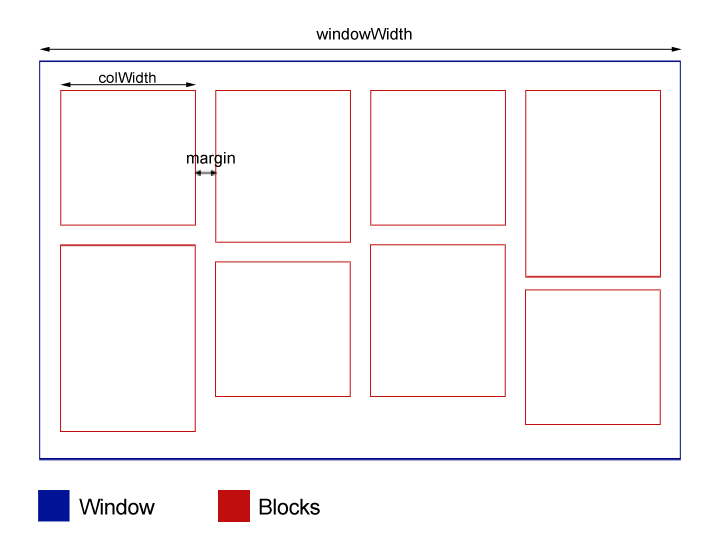
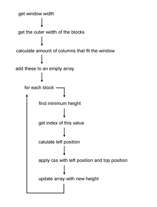
From this data, we then calculate the number of possibly blocks that would fit in the window. This gives us our number of columns, so in the diagram above, it would be 4. So we create an array with 4 values in, defaulted at the value of the margin. This array is used to store the running heights of each column. E.g. a block of height 120px is added to column 3, so that value in the array is increased by 120. We also use the index number of each value to calculate the position from the left of the screen. Here's a flow diagram of how the function will work. This will also run everytime the window is resized so the blocks can update themselves.
Setting Up The Blocks
So there's some information about the theory behind both Pinterest and jQuery Isotope. If it didn't make much sense then hopefully getting stuck into some code will help. To start, we need a simple HTML structure. From this HTML, we need to grab 3 vital values; the window width, the width of the blocks and the margin between the blocks.
The HTML Structure
<body onload="setupBlocks();">
    <!-- Create multiple versions of this with different content -->
    <div class="block">
        <p>Lorem ipsum dolor sit amet, consectetur adipiscing elit. Ut in dui velit. Curabitur purus odio, adipiscing ut vehicula at, pulvinar eu justo. Suspendisse potenti. Suspendisse dictum massa non mi posuere ac convallis nisi pellentesque. Morbi posuere mauris elementum metus intlla faProin et malesuada arcu. Quisque sed nulla odio, at interdum diam. Proin mollis, dui eget tristique dictum, diam purus hendrerit urna, lacinia interdum sem justo sit amet justo. Morbi a neque ut velit tempus auctor. Sed condimentum dolor in est facilisis id malesuad</p>
    </div>
</body>
The CSS
.block {
    position: absolute;
    background: #eee;
    padding: 20px;
    width: 300px;
    border: 1px solid #ddd;
}
The jQuery
var colCount = 0;
var colWidth = 0;
var margin = 20;
var windowWidth = 0;
var blocks = [];

function setupBlocks() {
    windowWidth = $(window).width();
    colWidth = $('.block').outerWidth();
    colCount = Math.floor(windowWidth/(colWidth+margin));
    for(var i=0; i < colCount; i++) {
        blocks.push(margin);
    }
    alert(blocks);
}
We start by setting some global variables, along with our empty array we'll be using to store the heights of each column. Then, when create our function 'setupBlocks'. This does as it says and sets the blocks up correctly for positioning.
Note: We use onload on the body tag to call our setup function.
In the setup, we grab the width of the window, along with the width of the blocks. We set the window with as 'windowWidth' and the blocks width as 'colWidth'.
The next line calculates the number of columns that will fit in current window. Here we add the margin to the width of each column and then divide the window width by this number. Finally, the number is rounded down to give us a whole integer.
We create a loop which creates values for each column. So if there are 4 possible columns that could fit in the window, there will be 4 values in the array.
The code above should produce something like this... DEMO
(try changing the width of the window and refreshing. take note of the effect this has on the array)
Positioning The Blocks
Did you notice what was happening? When the window was smaller, there were less number of values in the array. This is because there were less columns that would fit into the window.
Now we've set up our blocks and have an array of the starting heights of each column. So now we're just left to determining the position of each block. Here's the function, I'll go into more detail afterwards...
function positionBlocks() {
    $('.block').each(function(){
        var min = Array.min(blocks);
        var index = $.inArray(min, blocks);
        var leftPos = margin+(index*(colWidth+margin));
        $(this).css({
            'left':leftPos+'px',
            'top':min+'px'
        });
        blocks[index] = min+block.outerHeight()+margin;
    });
}

// Function to get the Min value in Array
Array.min = function(array) {
    return Math.min.apply(Math, array);
};
Let's break this function down. Firstly we definite the function with the name positionBlocks. We then loop through each element on the page with the class 'block'. Two variables are then set. The first is 'min', which represents the lowest value in the array, which is also the column with the lowest height. The next is index which represents the index number of this value, along with the column number we need to place the next block in.
E.g. our array looks like this [20, 95, 75]. The lowest number is 20, so min=20 and index=0. We can then calculate the position from the left of the screen based on these numbers.
function positionBlocks() {
    $('.block').each(function(){
        var min = Array.min(blocks);
        var index = $.inArray(min, blocks);
To calculate the left position, we add the width of each column to the margin, multiple that by our index and finally add another margin. This additional margin acts as a padding on the left of the window. The new leftPos value and min is applied to that block. The last line is simply updating the array with the new height. This height is calculated by adding the current height, to the height of the current block and the margin.
var leftPos = margin+(index*(colWidth+margin));
$(this).css({
    'left':leftPos+'px',
    'top':min+'px'
});
blocks[index] = min+$(this).outerHeight()+margin;
The function at the end is used to get the minimum value from the array. You can read more about it here John Resig. We finally need to call the function 'positionBlocks' to the end of the 'setupBlocks' function so it runs.
Then you're code should produce something like this... DEMO
Finishing Touches
You'll notice that if the window is resized, nothing happens. It's because we haven't added a function to fire when the window is resized. To do this, add the following code to our loading function, below setupBlocks();
$(window).resize(setupBlocks);
So that is it really. You should have system that looks and works just like Pinterest and jQuery Isotope. Another good addition is to add this to block class in your CSS:
.block {
    -webkit-transition: all 1s ease-in-out;
    -moz-transition: all 1s ease-in-out;
    -o-transition: all 1s ease-in-out;
    -ms-transition: all 1s ease-in-out;
    transition: all 1s ease-in-out;
}
This will animate the blocks both on load, and when the window is resized. I hope this has been some help to you. I really enjoyed building this solution and working with the maths behind the scenes.
Feel free to comment if this makes no sense or you're having problems with the code.
Check out the finished code here
Also, check out the demo that keeps the blocks centered in the screen